5 Tips to Create Accessible Designs in Canva
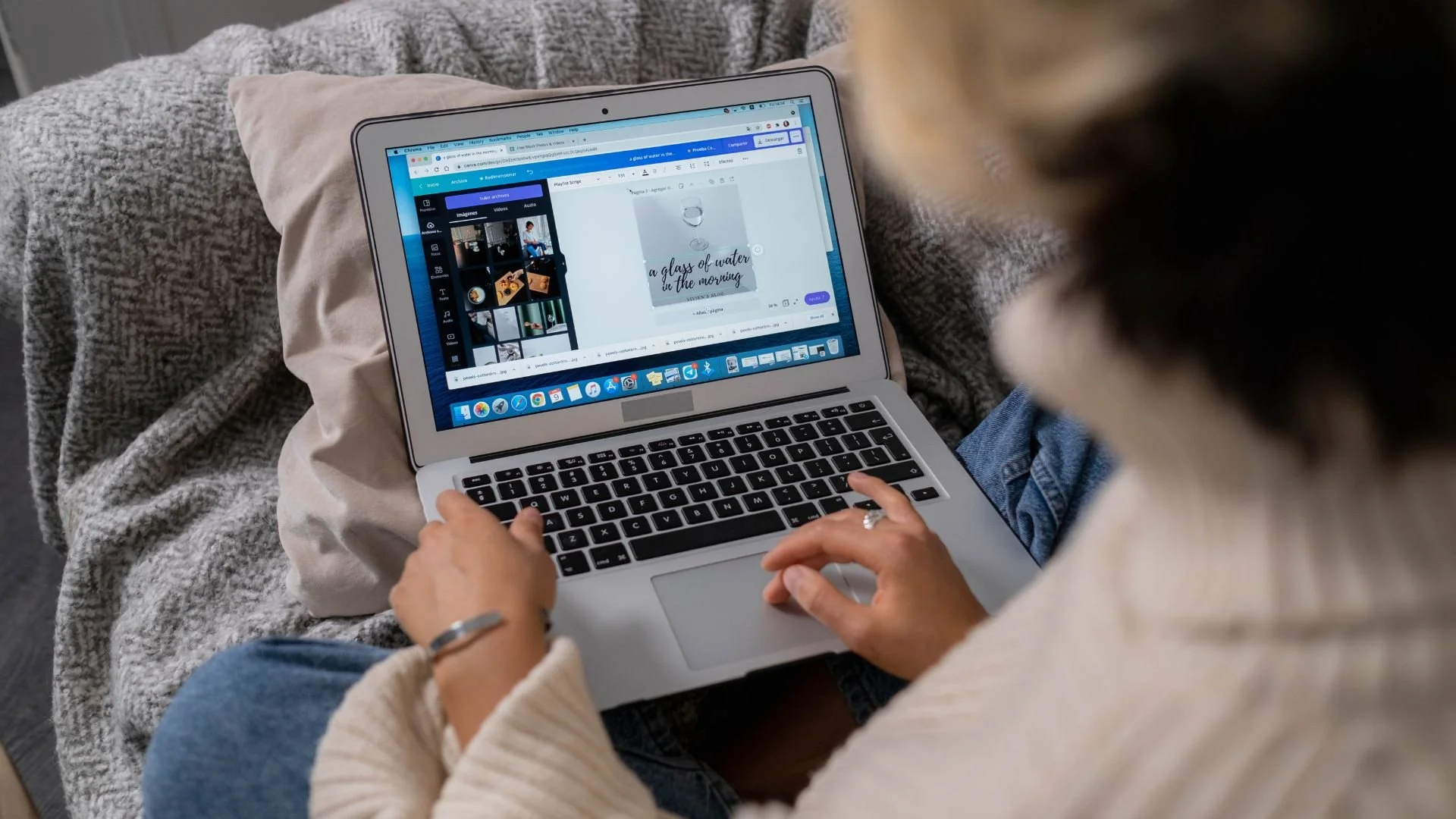
Canva is an awesome free tool that makes graphic design easy. With thousands of templates and millions of images and graphics at your fingertips, you don’t need to be a graphic designer to create beautiful designs for your marketing campaigns. Plus, if you’re a nonprofit, you can get all of the premium features of Canva Teams for free!
When you’re using Canva to create infographics, presentations, reports, email headers, or flyers, it’s important to make sure that your designs follow accessibility standards. This will make your content inclusive and usable by everyone. But what exactly does that mean? Let us break it down for you with these five tips.
#1: Choose your font carefully
One of the most important aspects of your design is your text. Choose a sans-serif font such as Arial or Helvetica, since they are easier to read than serif fonts. Avoid overly decorative fonts that may be harder to read. While these are often beautiful, fun fonts, it can take our brains an extra few seconds to register what the text says.
The bolder your font, the better. Stay away from “light” whenever you can, and opt for “regular,” “semi-bold,” or “bold” instead.
Stick to one or two fonts throughout your design. Change up the text size and spacing between letters if you want to mix it up. This way, people don’t have to process many different fonts.
Choose a font size of 12pt or larger for body text. Anything smaller will be challenging for readers with visual impairments. For headings in Canva, go for at least 16pt.
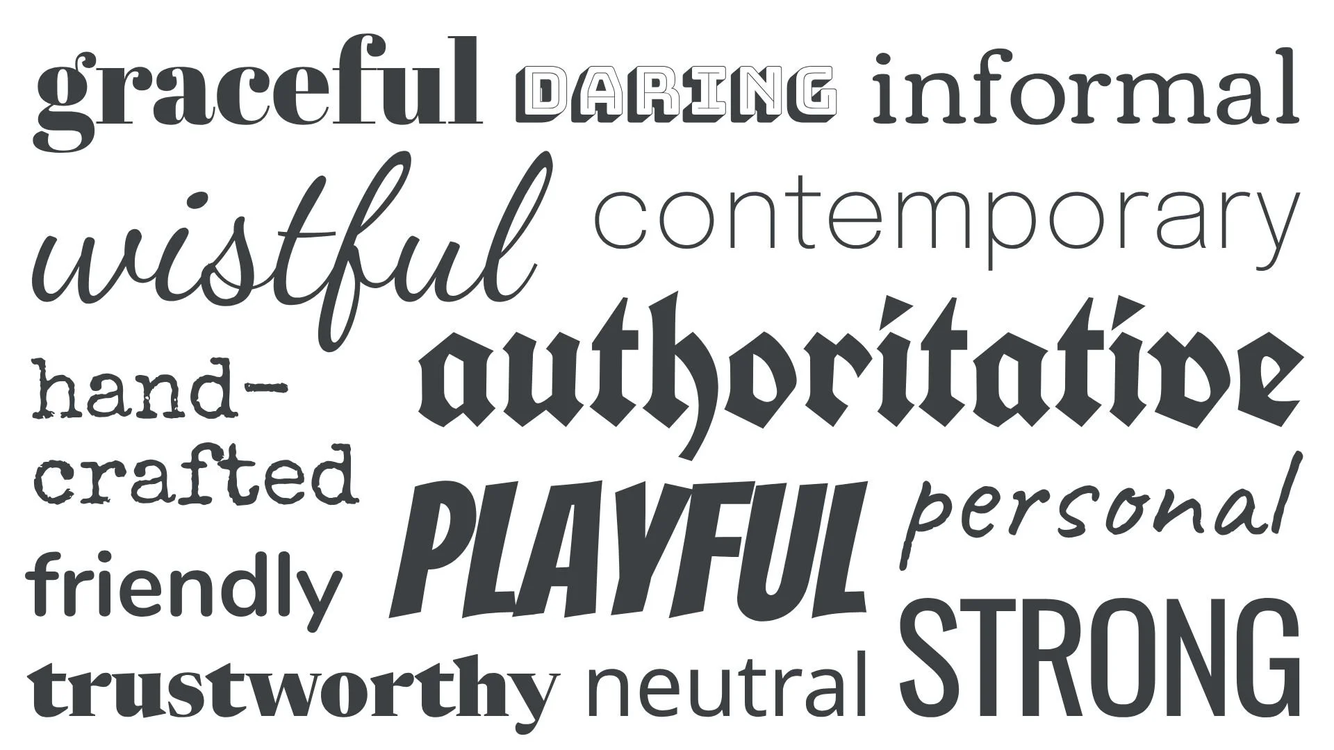
Image credit: AccessibilityChecker.org
#2: Use white space to boost readability
Add ample white space between letters, lines, and blocks of text to make your content easier to digest. If your design feels condensed or congested, your readers will likely get overwhelmed and stop reading. If you don’t have enough room in your design to include white space, you’re probably including too much information! It’s time to think about where you can reduce your copy.
Canva makes it easy to format your text, including options to adjust letter and line spacing. Play around with the settings on your design to find an option that is easy to read. Bonus: share your design with a colleague and get feedback. A fresh set of eyes can offer a helpful perspective.
#3: Select high-contrast colors
Ensure that you have sufficient contrast between text and background colors so that people can read what you write. If it’s too low-contrast, people with color blindness or limited vision won’t be able to read it at all. Low contrast occurs when the text color is too similar to the background color, such as yellow text on a white background, or white text on a light blue background.
Your best bet is to use a dark-colored text on a light-colored background, or vice versa. Use the handy Coolors color contrast tool to check your color choices. It can tell you whether your contrast passes the test at different text sizes. The contrast ratio you’re looking for is 4.5:1 at a minimum for normal text.

Image credit: Accessibility @ MC Blog, Montgomery College
#4: Check your design
Now, let’s put your design to the test! First, use Canva’s Design Accessibility feature to check your designs for any issues once complete. To do that, open your design and select File > Accessibility > Check Design Accessibility.
Then, download your file and upload it to the Coblis Color Blindness Simulator. You’ll be able to see what it looks like to someone who has color blindness. See what might need to be changed.
#5: Add alternative text to images
Once your design is complete, be sure to add alternative text wherever you post it, whether that’s on social media or your website. This allows people who have low vision or use screen readers to understand your content.
Imagine that you’re on the phone and describing your design to someone. This should help you decide what information to include in your alt text. Put the most important at the beginning, and be as concise as you can. Usually, just one sentence is needed.
For PDFs, PowerPoints, or websites designed in Canva, you can add alt text directly to your design by right-clicking on your images and selecting “Alternative text” to add the description. If your image is just decorative and doesn’t need alt text, you can mark it as such.

Example source: Mangools
By following the tips above, you’ll be well on your way to creating Canva designs that are inclusive and accessible for all users.
Want to learn more about digital accessibility? Check The A11y Project’s free online education and resources. They aim to create beautiful, accessible, and inclusive digital experience—something we all aim to achieve!

Need help putting these tips into practice? Book a Free Office Hours time slot with our digital marketing experts. Bring this or any other digital marketing question you have, and we’ll spend an hour troubleshooting challenges and brainstorming solutions with you.
